Showing posts with label Photoshop. Show all posts

Monday, October 4, 2010

Short guide on Color mode selection

 
You might have across the RGB, CMYK mode and wondered what these are used for. I did not have any knowledge regarding these until one of the posters I designed was sent back citing the mode was wrong. And thus I decided to learn the valuable lesson about various modes of designing in Photoshop. Making it as simple as possible and condensing everything into a few lines, here is how you use it. (You can select the mode in the menu from Image>Mode).
RGB
Red, Green, Blue mode is used primarily for digital photos and those designated for computer screens like webpage graphics. Inkjet printers also use the same.
CMYK
So this is the one to select if you are doing the work for print purpose. All offset printing use this mode and so is for high-end inkjet printers.
Grayscale
This is the usual Black and white which can be used for both purposes mentioned above- printing and web-based images.
Indexed Color
This mode limits your color selection to 256 or a Color table. This is used for web-based images where the size of the image needs to be limited by saving it as GIF or PNG8 especially in case of buttons and banners.
Lab Color
Lab mode is used only when you need to use some filters like Sharpen filters (which will of course be prompted). We have to change the mode back to RGB or CMYK before saving the work.
Duotone
Meaning two color tones used throughout your image, it is used solely for commercial printing purposes, but not on inkjets.
Bitmap
Bitmap is simply Black and white and the difference is there are no gray tones in between as in grayscale. You can use it anywhere, but the image always looks so.
Multichannel
It is similar to duotone where premixed colors are used. It is used for commercial printing purposes and mainly for logo designing. 

But always remember that changing from one color mode to another reduces the quality of your image and hence need to be done beforehand. Moreover, converting back to your original mode does not retain the original quality.

Tuesday, June 15, 2010

Designing the soccer craze: The few best


Formally included in the Brazil fans in the college, we had a lot to do in order to cope up with the fanfare of the Argentineans. Being a Brazil fan is easy, but being a designing enthusiast as well as a Brazil fan is not. It was a rather difficult task checking out the web some high quality images for preparing some posters and ultimately I had to give up. But meanwhile, I had come across a few graphic websites which offer a few better opportunities and collections. The best may not have been yet found out, but ideas and inspiration still glows behind them. A collection of designs, rendering, signatures, PSDs, wallpapers all exclusively for sports...
This was the best I came across. Have a look at some of the collections. Large PSD packs are waiting for you at sportsGFX.


Exquisite collection of wallpapers. Not just soccer.

Here are a collection of renders in sports, movies and a few more categories. Quality compromised, but better than many... 
 And now a few places where you can search and search and search and skip through the pages to find the right one...
If you have come across anything still beautiful please provide the link. Surely, it will be published with acknowledgements.

Saturday, May 1, 2010

7 Step Transparency Effect Poster Design Tutorial


I would love to share one of my recent creations with you. It was a poster for the release of a magazine in our college. Though not so perfect in any sense, it was a work which took just several minutes from a day. And I believe it is not that bad either.
So I had earlier decided that my next poster or brochure would be something based on the transparency effect. The inspiration behind this was the simple picture shown below, just the difference in its tones. It was much more beautiful than what I had done (but I had to move on with a theme background for the magazine).


The steps are simple

  1. Choose a background which suits your idea

  2. Make necessary corrections (especially make it bright)

  3. Draw a black colored rectangular area of your choice over the background after creating a new layer

  4. In the ‘Layers  window’, adjust the transparency of the square

  5. Now pen down your texts over the translucent region

  6. ‘Merge down’ the text layer to the translucent rectangular layer (from Layer menu tab)

  7. Using the ‘Magic wand’ and ‘Delete’ button cut out the letter so that the background layers are visible through it (thinks there would be better solutions to this problem. But after all, I am not an expert in Photoshop)


Now you have got your poster ready to be pasted


This especially works better if the background is colored bright enough. Dark backgrounds work better with a grey translucent bar. This simple poster can save a lot of your time, without compromising on the design part. I invite any better ideas like this or suggestions regarding that text editing as I have been learning Photoshop only through trial and error. I don’t think I need to provide the PSD, since these 7 steps are much easier than you can imagine. But you can download the background image from here...


Wednesday, April 28, 2010

7 Extra ordinary Artists and 36 Paper artworks

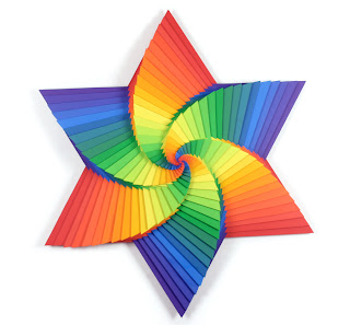
Paper artwork is something one thinks of a sheer waste of time and possibly an unwelcome source of revenue (rather cheap). But designing is taking into new forms with origami paving way for these colors and curves. These do find their place in the charts of excellence and among the cover designs of books and albums. Creating an idea and designing it with paper, I believe, needs courage in addition to creativity.

I am actually afraid as the undo key is not available here and much of my efforts may go in vain if I try one of these. The X-factors should play the perfect role to make it come attractive. The fact is that you can find much unattractive ones in the net. So selecting the best is simple but rather time consuming, though only a few create such ones. So here are a few selection of mine.

1. Yulia Brodskaya at Artyulia


2. Carlo Giovani and at Flickr


3. Andrea Russo Papercraft at Flickr


4. Jen Stark


5. Boveylee


6. Zim and Zou


7. Charles Clary of Paper Extravaganza


These artworks would not be of any use unless they find their right place. The ones featured above have been covered enough. So do forward your artworks and popularize them.