I have never thought newspaper as a target for designing. But I understood that all my predispositions were misplaced when I recently came across a Behance article. It was about redesigning one of the popular newspapers which I read daily and spans whole 16 pages into a single page paper. Though I have ogled a lot about the projects for the architecture and designing students, I was really astonished with this creative endeavor (may be I haven't seen enough of the design web). Anyway please do have a look at the project: Behance:Express-Newspaper
As usual rest of my day was finished in finding the best of newspaper designs around the world and I have found a few. The ones that touched my tastes are listed here. Do comment on the ones you like and the ones you have found elsewhere.
1. De Morgen
Awarded the Europe's Best Designed Newspaper which can be called the Oscar in Newspaper design. The use of easily comprehensible graphics is adopted as you can see in the online newspaper from the site of this Flemish paper.
2. der Freitag
This bold and simple newspaper design was adjudged the best by SND. Click the link for the 3 best newspaper designs and the images for the inside pages.
And along are some of the winners in other categories and those who have entered the list: Periodic winners
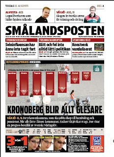
3. Smalandsposten
This was awarded in the tenth European Design Awards
Some others in the list are
6. 24sata
Look at some of the other visualisations and infographics
Into visual story telling. Read more about it in the link provided.
7. Seattle Times: Mariner's Makeover
9. The Oregonian
10. Die Zeit
12. The Guardian
13. Aripaev
14. Hartford Courant
15. Dubai Express
18. Politiken
The links provided in the above lists would be useful in browsing through some of the best designed newspapers in the world. It is a fact that European newspapers are better off when it comes to designing and usage of infographics though the rest of the world is catching up.


